when looking at different films from different genres it is clear that the typography reflects the genre of the film.
I looked at some clear examples of this, transformers is a heavily action based and movie and has a metallic feel to the text. enforcing the strong masculine orientation of the film.
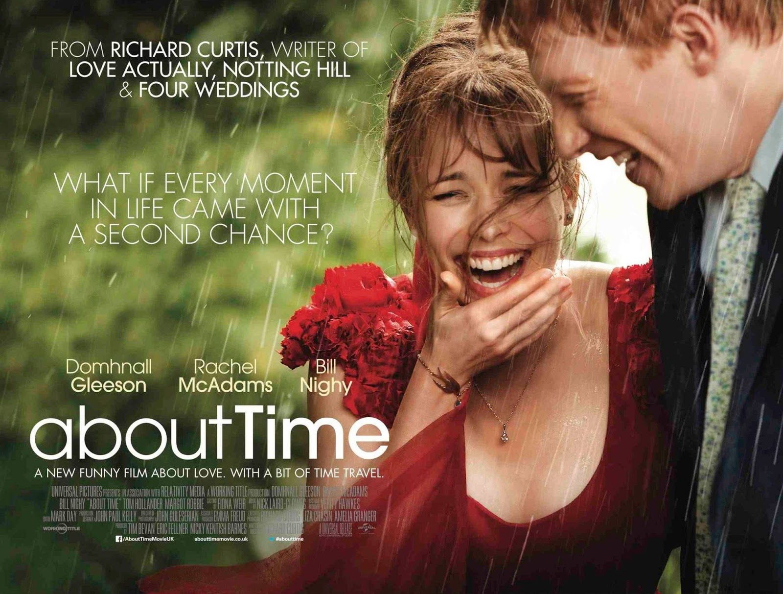
on the other hand about time is a light hearted drama and that is indicated from the typography. and relates closely to mine.
i used my research to think of the kind of typography i would like to use for my titles and the fact that my opening sequence features a child could help with my decision. also the fact that is a coming of age tale could encourage the idea of a hand written child like font.
This font is called on the move
I also considered a more sophisticated looking typography
No comments:
Post a Comment