Final idea
the sequence will start with introducing the location showing creative and intresting shots of the location accompanied with an over voice of the main prostagonist. possibly reading a poem or a writen monolog. in these shots the opening titiles will play fading in and out. the monolouge/poem will end and the shot will change to the young man and the child getting off a bus. walking home the kid in front. getting home and the child running upstars as soon as he gets through the door and then shotting his bed room door. and the young man shutting the door and putting his head in his hands.
I soon realised my film idea did not follow todorovs rule of equilibrium> disequilibrium > equilibrium, the death of the mother breaks the equilibrium at the very start but the film does have moments of equilibrium followed by disequilibrium resolved by equilibrium, but just in much shorter time slots. This is due to the fact my film is following the life of these characters and often life is like that.
Monday, 13 January 2014
Typography research
typography research
when looking at different films from different genres it is clear that the typography reflects the genre of the film.
I looked at some clear examples of this, transformers is a heavily action based and movie and has a metallic feel to the text. enforcing the strong masculine orientation of the film.


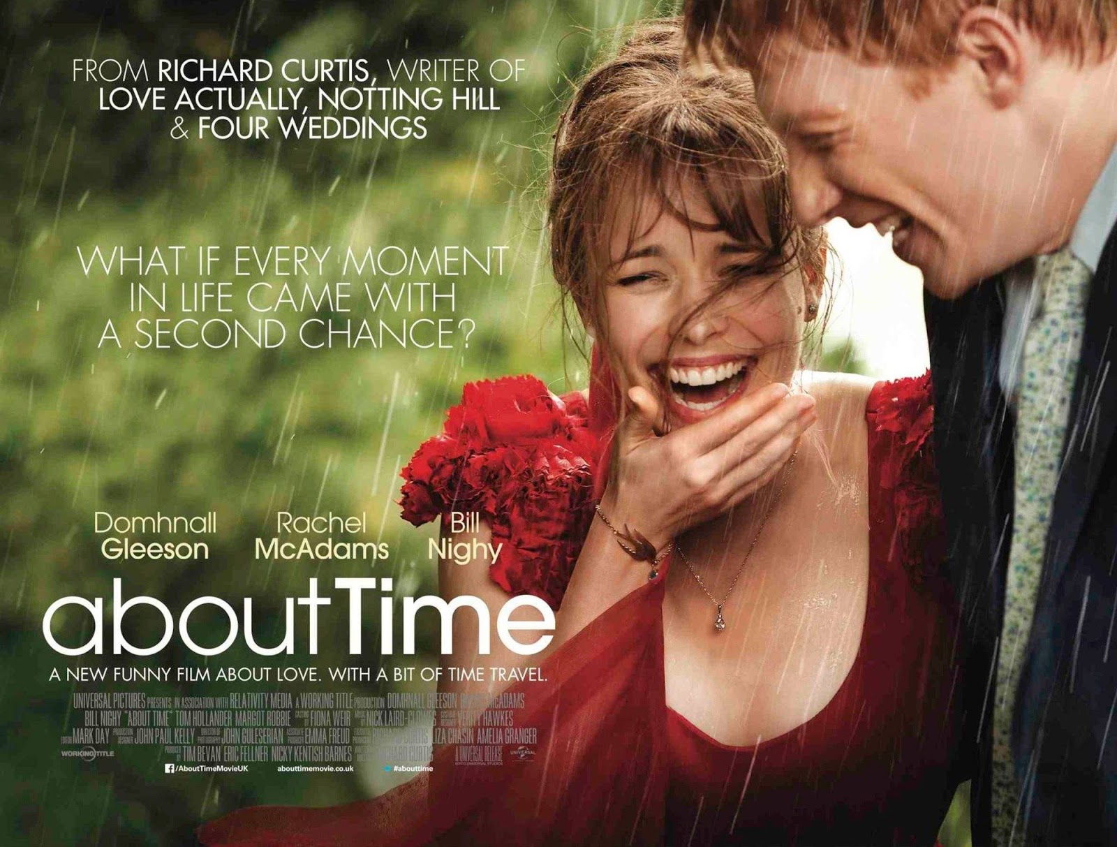
on the other hand about time is a light hearted drama and that is indicated from the typography. and relates closely to mine.

i used my research to think of the kind of typography i would like to use for my titles and the fact that my opening sequence features a child could help with my decision. also the fact that is a coming of age tale could encourage the idea of a hand written child like font.
This font is called on the move
I also considered a more sophisticated looking typography
when looking at different films from different genres it is clear that the typography reflects the genre of the film.
I looked at some clear examples of this, transformers is a heavily action based and movie and has a metallic feel to the text. enforcing the strong masculine orientation of the film.
on the other hand about time is a light hearted drama and that is indicated from the typography. and relates closely to mine.
i used my research to think of the kind of typography i would like to use for my titles and the fact that my opening sequence features a child could help with my decision. also the fact that is a coming of age tale could encourage the idea of a hand written child like font.
This font is called on the move
I also considered a more sophisticated looking typography
Friday, 10 January 2014
Subscribe to:
Comments (Atom)